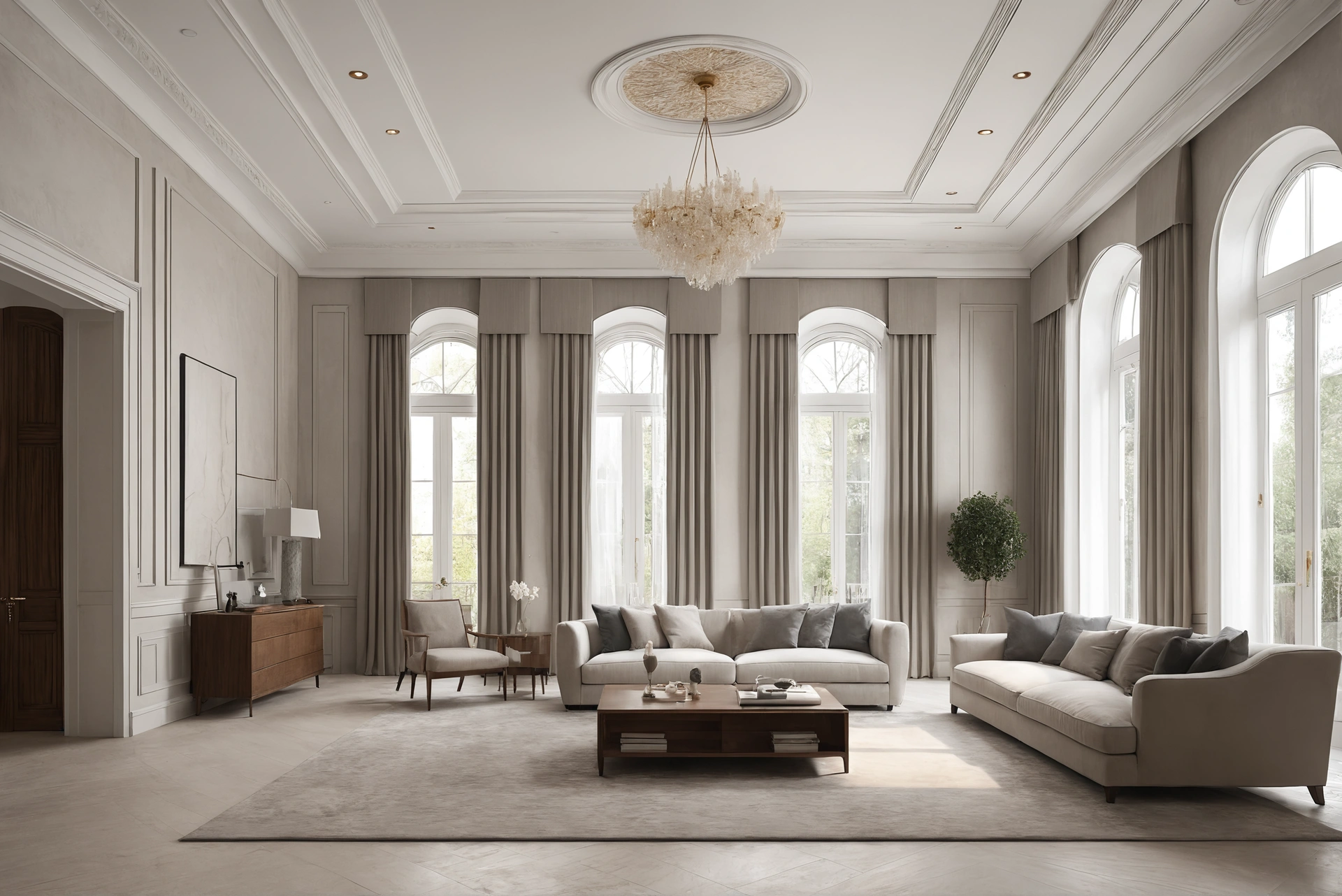
The palace interior never went out of demand; it went out of context, and the design problem today is translation: how the language of state rooms, axial symmetry, noble materials and ceremonial scale, speaks inside a modern home without turning it into a film set. The grammar of palace architecture design turns out to be surprisingly portable when it is treated as proportion rather than ornament, and Antonovich Group, a Dubai company with published palace interiors in Riyadh and Doha, has built much of its reputation on exactly this translation for Gulf villas and penthouses. The failures are as instructive as the successes. Palace style fails in modern homes when it is applied as decoration; it succeeds when it is built in as architecture, which is a difference visible in three specific places.
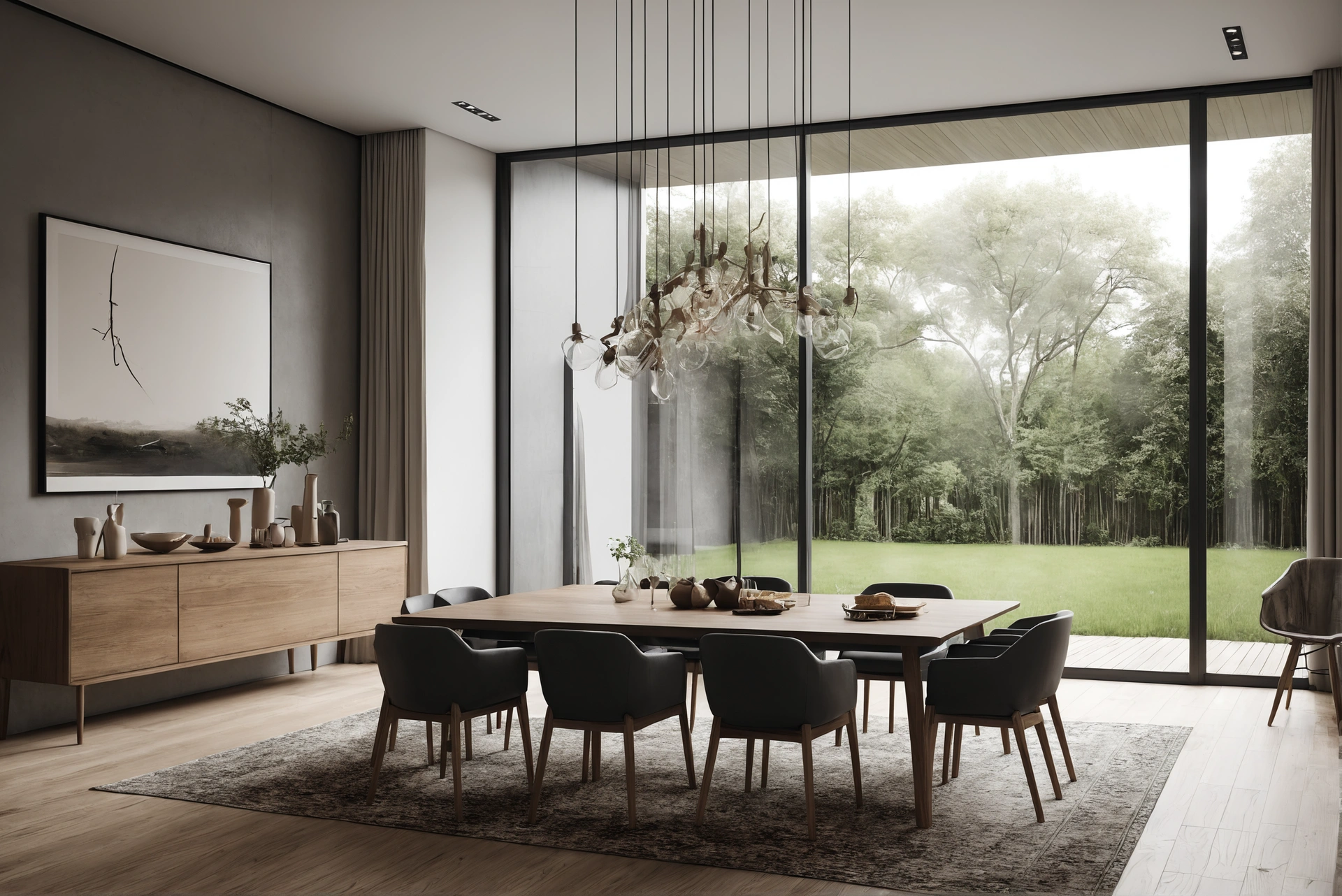
Scale: the palace effect is vertical before it is ornate
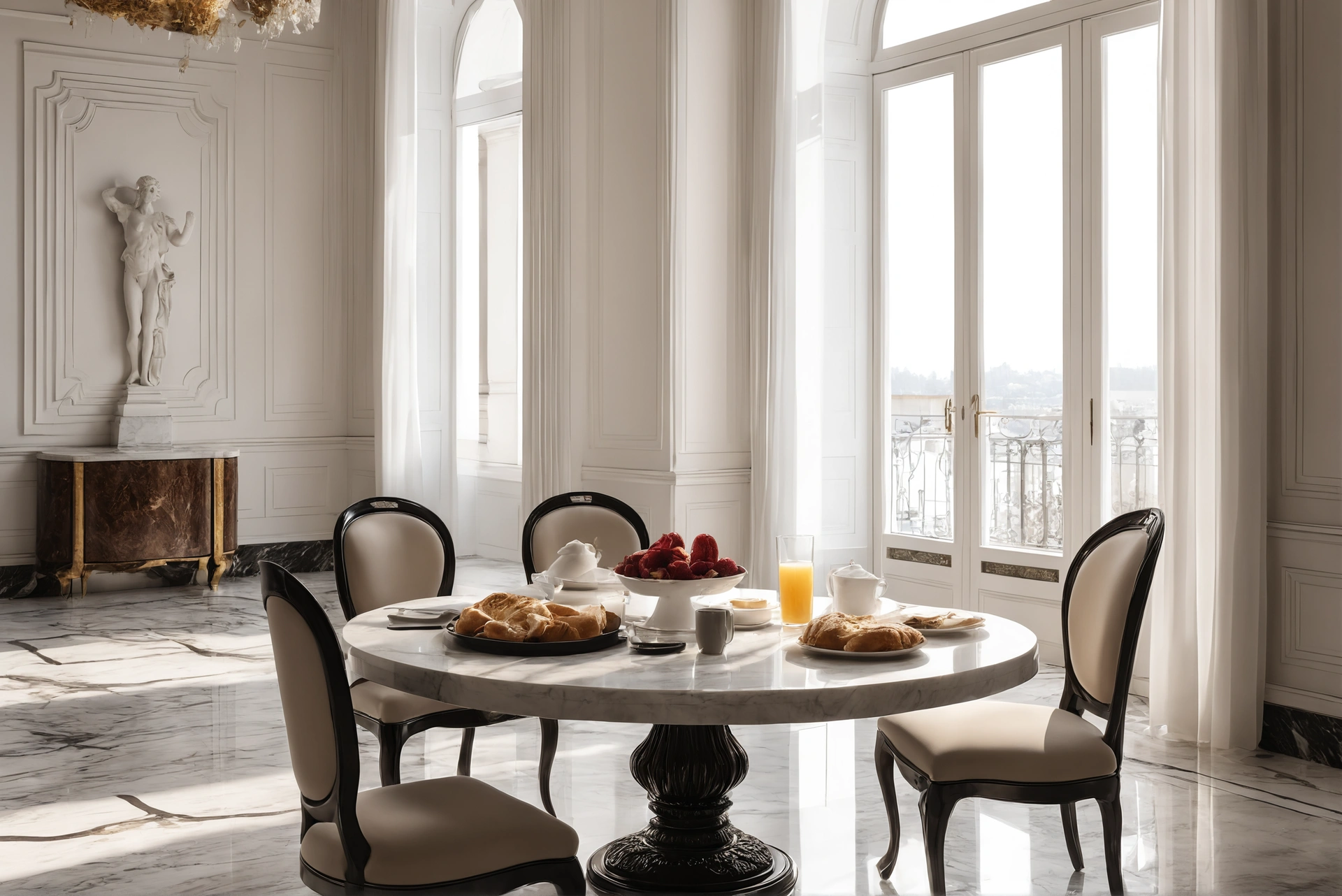
What reads as palatial in any room is first of all height honestly used: tall doors, full-height windows, a ceiling treated as a composed surface rather than a lid. A modern room with generous height, floor-to-ceiling openings and one strong ceiling gesture already speaks the language before a single gilded object arrives.
Scale discipline also means hierarchy. Palaces grade their rooms, and a home borrowing the style should choose its one or two state rooms, the entrance hall, the majlis, the formal dining, and let them carry the full register while other rooms calm down. Palace everywhere is palace nowhere, and the corridor does not need a cornice fighting the bedroom's.
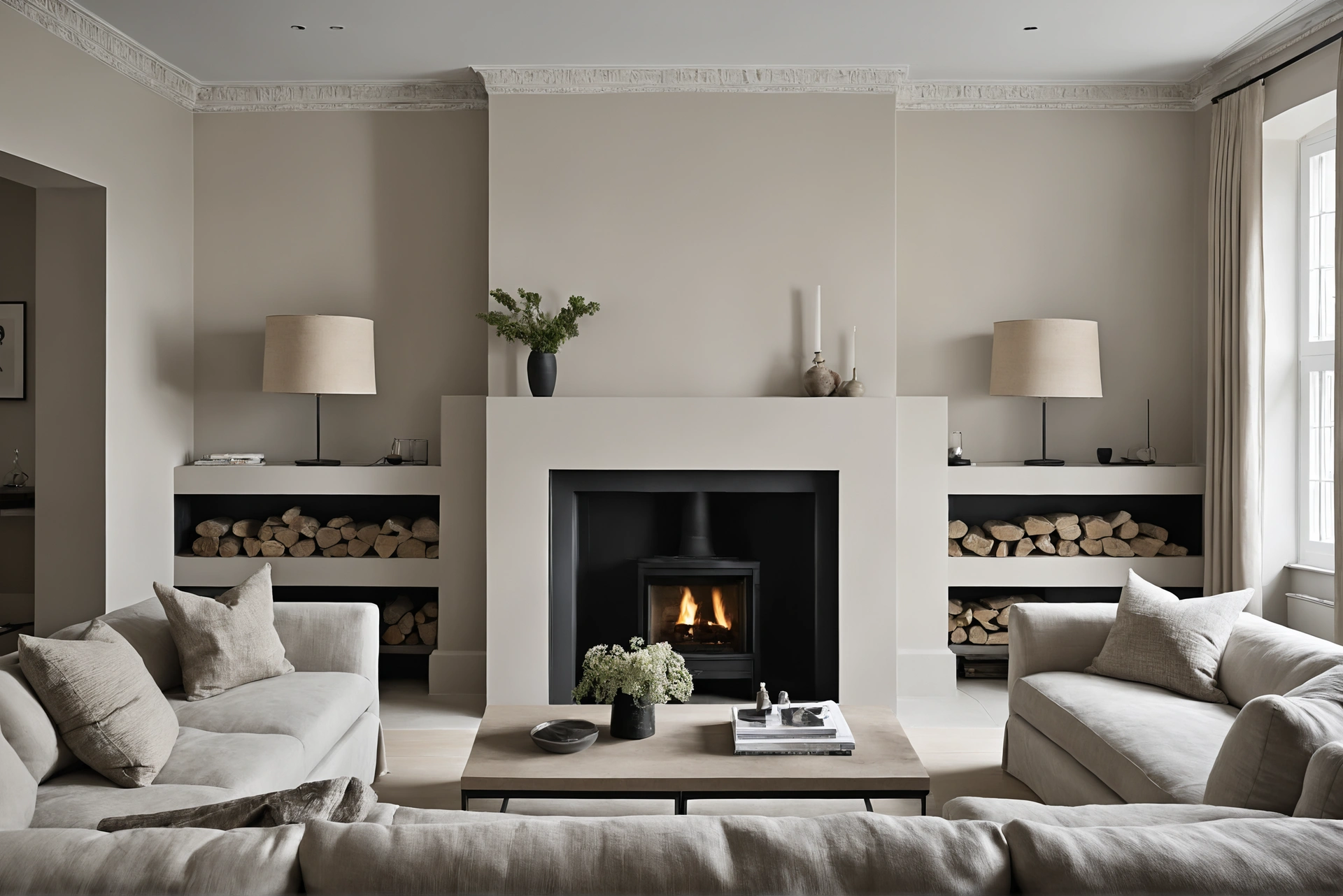
Symmetry: the cheapest palace material
Axial symmetry costs nothing at drawing stage and produces the style's deepest effect: the centred door, the fireplace answered by matching openings, paired consoles flanking an axis that ends in something worth seeing. A symmetrical room furnished symmetrically feels ceremonial in plaster and linen, long before marble enters the budget.
Modern plans can hold classical bones
Open-plan living resists symmetry only when zones are shapeless. Defining the dining zone with a dropped ceiling on axis, centring the seating group on the fireplace wall, aligning the kitchen island with the terrace doors: these moves give a contemporary plan the classical skeleton, and the two languages stop arguing.
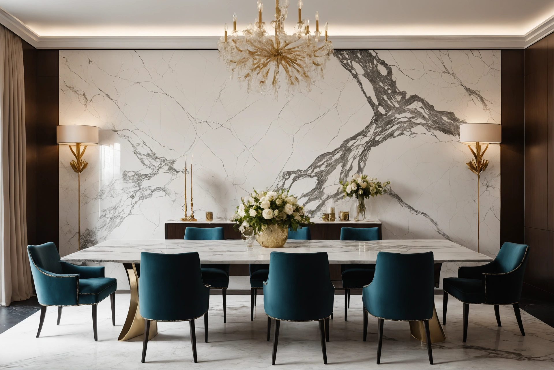
Materials: noble, but edited
The palace palette, stone, hardwood, bronze, silk, plaster relief, survives translation through editing: fewer materials, larger fields, real ones. A book-matched stone wall behind the dining table does the work of five ornamental surfaces; wide oak boards outperform intricate parquet; bronze appears at the door handle and the light fitting, where hand and eye land.
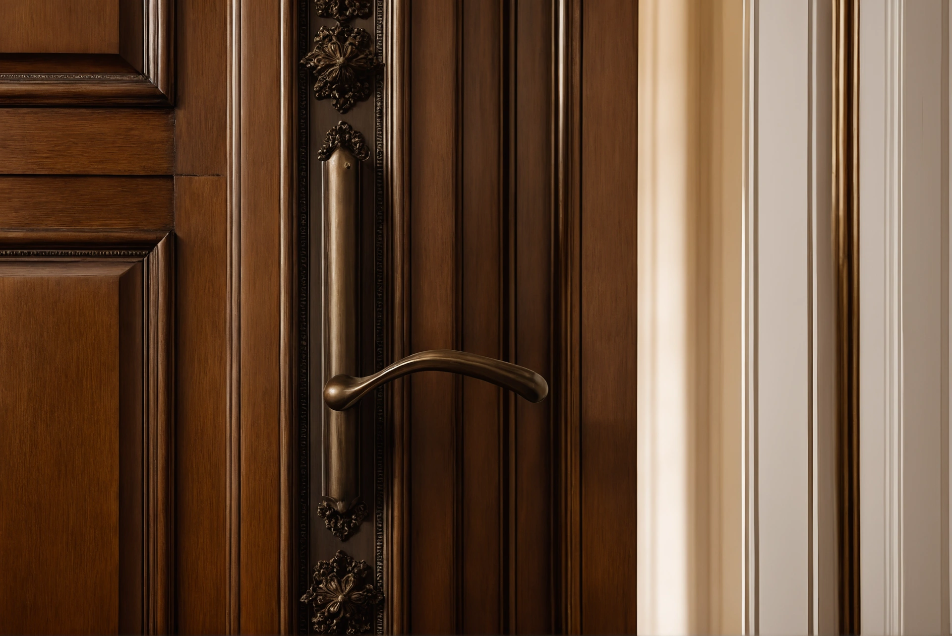
Ornament earns its place at thresholds and datum lines: cornices where wall meets ceiling, panel mouldings that organise a wall for the artwork it carries, a stair rail worth touching. Ornament spread evenly reads as wallpaper; ornament placed at the architecture's joints reads as craftsmanship, which is what the palaces meant by it.
Getting the translation built
The practical route runs through drawings, because every palace effect worth having is structural or joinery-grade: ceiling geometry, door heights, panelling set out to the room's axes, stone laid to a setting-out drawing. A decorator can style the result; only the drawing set creates it, which is why the style enters the project at concept, not with the furniture.
The test of a successful translation is domestic, not photographic: the room hosts a formal dinner without effort and a quiet breakfast without irony. Palaces, for all their scale, were homes that worked daily, and that is the part of their design most worth inheriting.